
Six essential pages for a commercial website
Conversion elements that turn visitors into clients
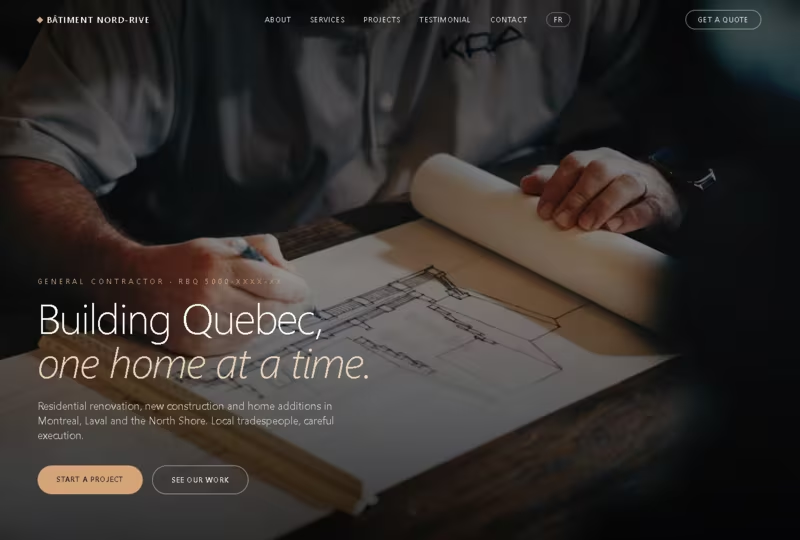
A clear call-to-action without having to scroll, so a visitor doesn't have to hunt for it to get your services.
A click-to-call or emergency contact button, visible on every page. Because sales often happen over a phone call.
Before/after photo galleries of products or projects, proof of real work convinces faster than any sales copy.
Client reviews and testimonials, displayed on the homepage, not linked off to a third-party page.
Listed service areas, so local searches and local SEO actually connect you to nearby clients.
A fast, mobile-first design, since most people looking for a service do it with a phone.
Mistakes that quietly cost you leads
A phone number that isn't clickable on mobile. About half of visitors give up rather than copy and dial it manually.
Generic stock photos instead of real job photos. Visitors can tell, and it undercuts the trust you're trying to build.
No reviews or testimonials anywhere on the site. Even a handful of real reviews changes how a visitor sees you.
A contact form buried at the bottom of a long page. If it takes effort to find, most visitors won't look for it.
No mention of which areas you serve. People searching "[service] near me" can't tell if you cover their address.
A slow site that takes more than a few seconds to load. Most visitors leave before the slow page even finishes loading.
Questions our clients frequently ask us
How can I attract more clients with my website?
Put your call-to-action where visitors don't have to scroll to find it, show real photos of your work or products. Make your phone number clickable on every page. These three changes alone account for a large part of the difference between sites that generate leads and sites that just look nice.
How can I better convert my website's visitors into clients?
Make sure you show up for local searches by listing your service areas clearly. Respond to visitor requests within minutes, not hours. Speed of response affects conversion as much as the site itself.
Do client reviews actually make a difference?
Yes. A visitor comparing a few businesses will usually pick the one with visible, recent reviews over the one with none, even if the work is comparable.
What should be on my homepage specifically?
A one-line description of what you do and where, a call-to-action, a few photos, and a couple of testimonials.
In short: the sites that generate the most new clients all share the same backbone:
- a clear call-to-action without having to scroll,
- real photos, not stock images,
- an easy-to-find, clickable phone number,
- visible trust badges and reviews, and
- a fast, mobile-first build.
Agencies that specialize in websites (Tech JSP included) build these elements in from day one instead of bolting them on after launch.